
In order to test my assumptions and gain a better understanding of how people use and interact with the library, I conducted a series of interviews using an online survey to screen for candidates that matched a set criteria. The survey also posed a number of open-ended questions about general library use in order to gain more quantitative insights into people’s behaviors and feelings. This data confirmed users' need for an easier method to access the library's main service of lending books, as well as revealed areas for improvement for the current service.
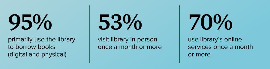
From the 23 survey respondents, I interviewed 5 people in one-on-one sessions to dive into more qualitative information about people’s specific goals, motivations, and pain points when using the library.
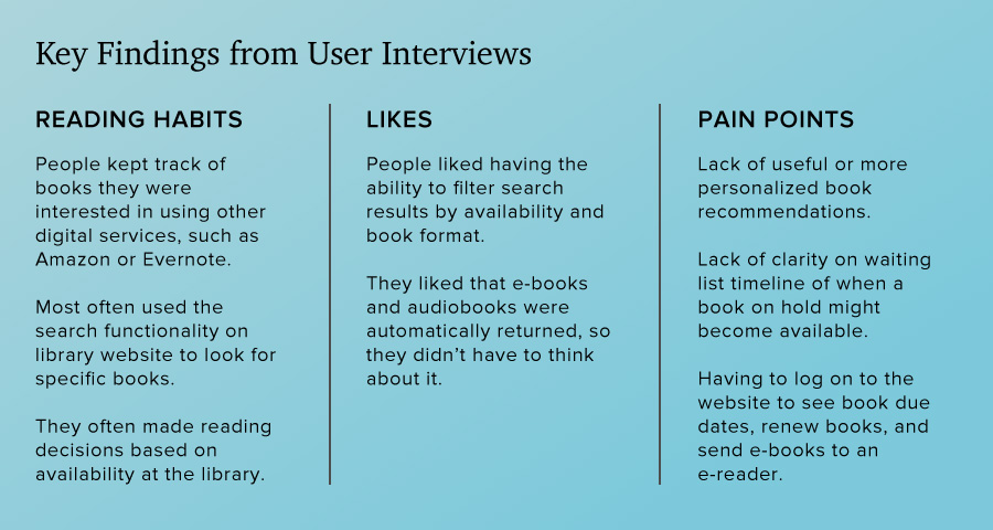
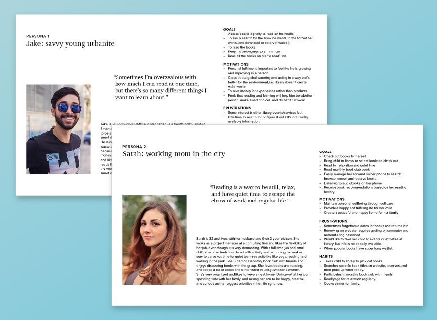
From this research I was able to synthesize my findings into two user personas, representing the core audiences that I am focusing on for this project. First, a tech savvy young person who loves learning new things and appreciates the library as a free resource that reduces unnecessary waste. And second, a busy working mom that loves reading as a way to escape from her hectic life. She enjoys the library as a way to save money, as well as a place she can bring her child for story time and books. I will refer to my personas as I develop the app to make sure I am making design decisions that align with my users’ needs.
Using the Nielsen Norman Group's guide to usability heuristics, I analyzed other library or book-oriented apps to assess features, usability, patterns and standards. This researched helped inform my design decisions while planning the NYPL app by noting what aspects of competitor apps were easy to use or conversely, caused usability problems.
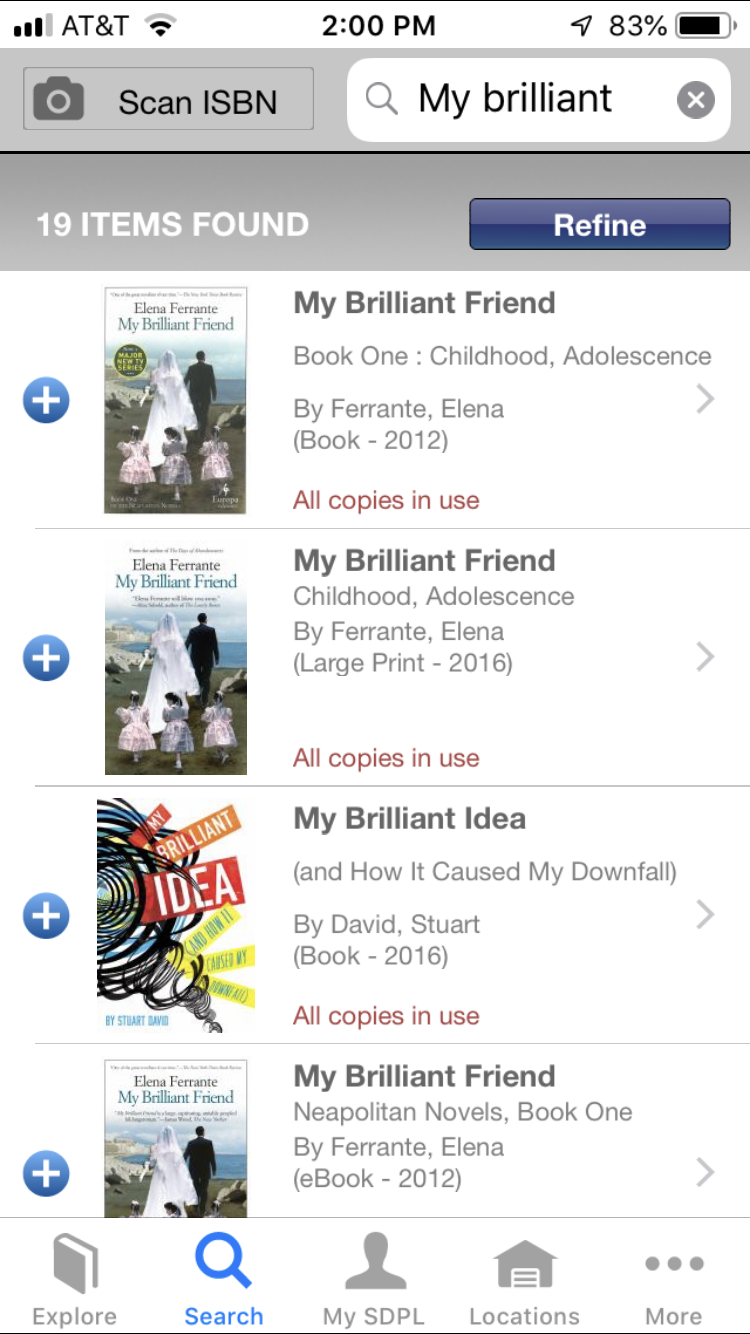
During my research, the SDPL app was noted as being particularly liked and useful, thus prompting me to include it in my research.
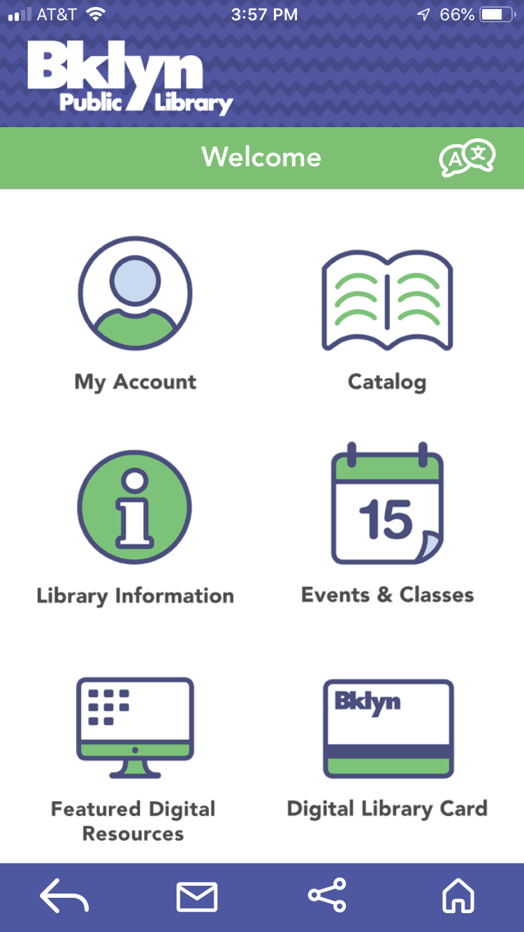
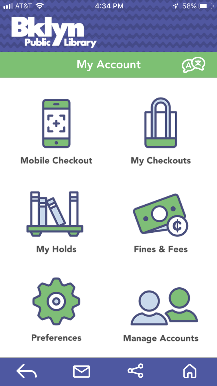
As a direct competitor of the NYPL, the BPL app seemed an important consideration as a service that my audience might be familiar with. While it has a visually consistent design, I found the interface difficult to navigate, and struggled to perform basic functions.
With my research concluded and a clear picture of my audience’s needs and motivations, I start to map out my app. I performed a card sort to help understand people’s mental models for task relationships, which gave me insight on where users expect to find specific information or perform certain actions. This data along with a competitive analysis of related apps helped me to outline a basic sitemap for my app.
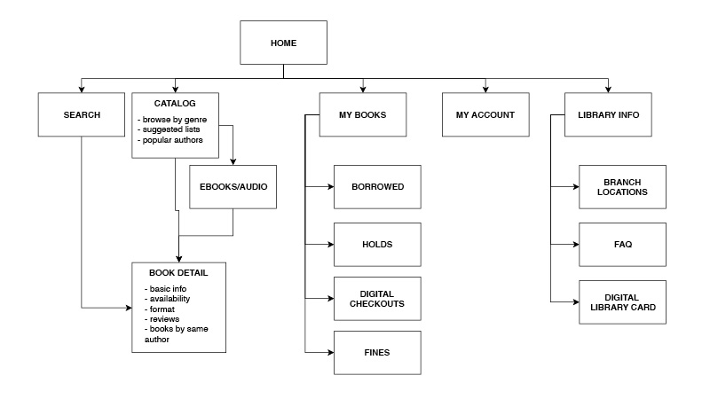
Next, I brainstormed user stories to outline the path a user would take to complete specific actions within the app. Using this quick brainstorm method to map out user scenarios helps make sure I consider all the necessary screens and actions when designing the app.
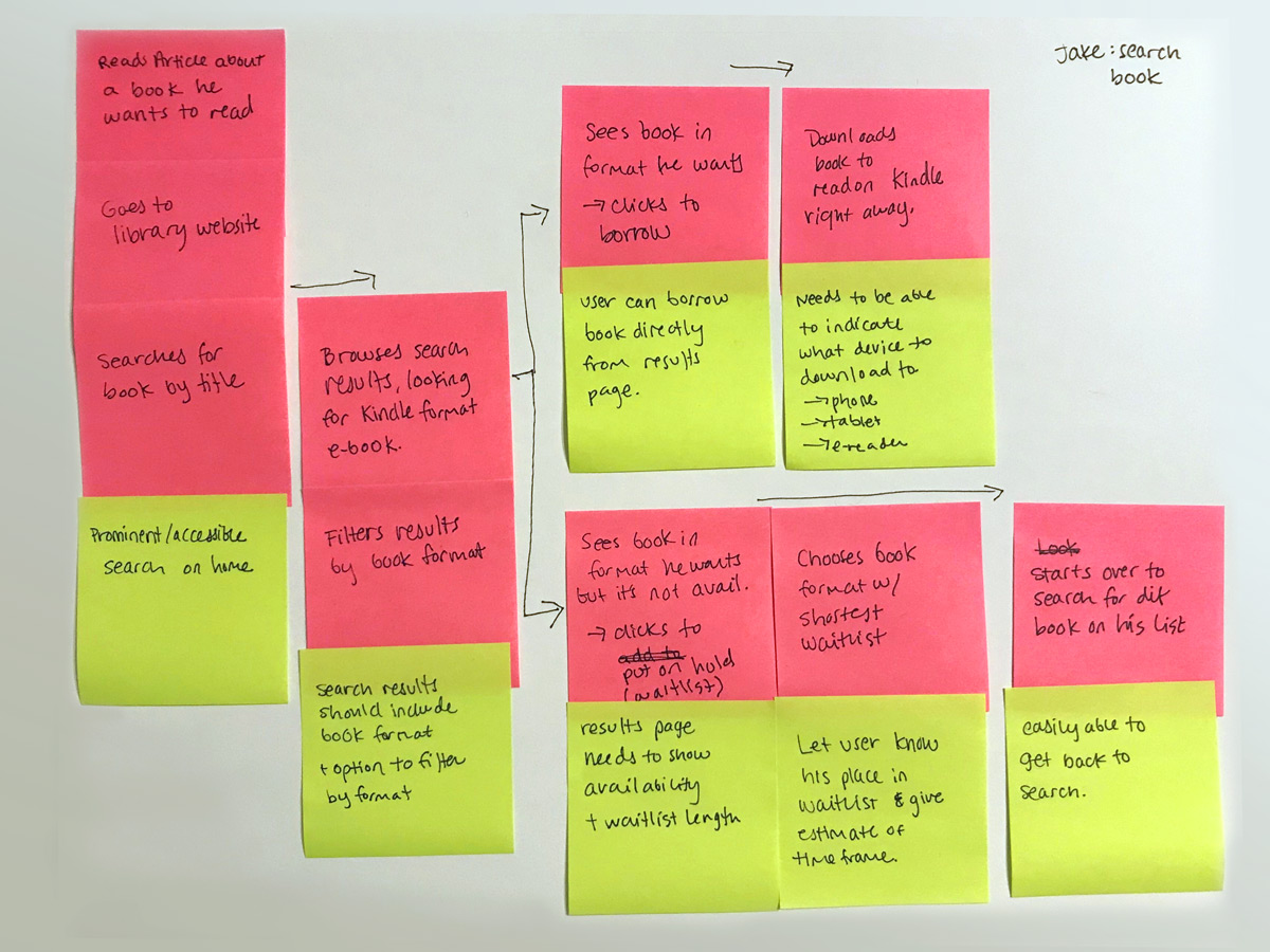
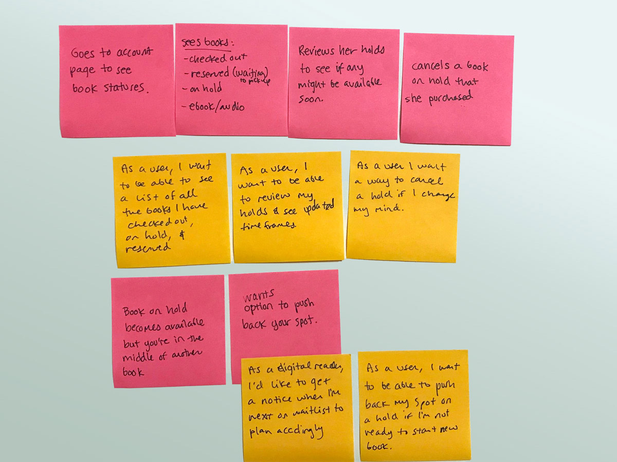
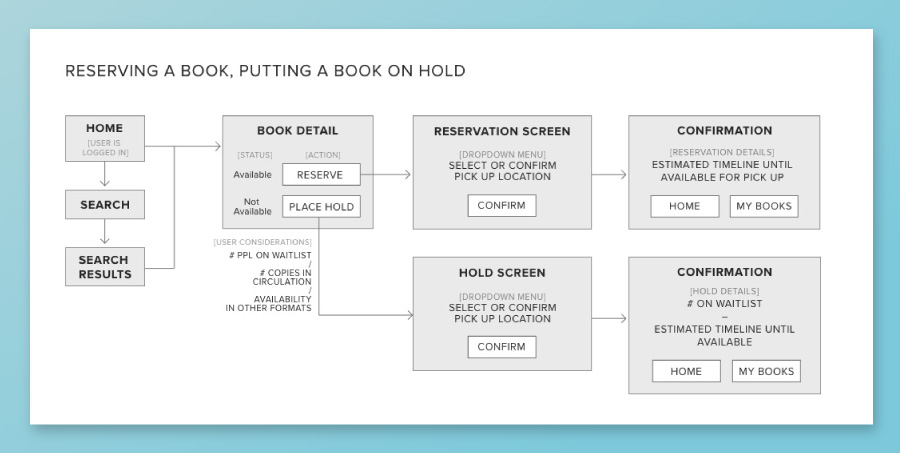
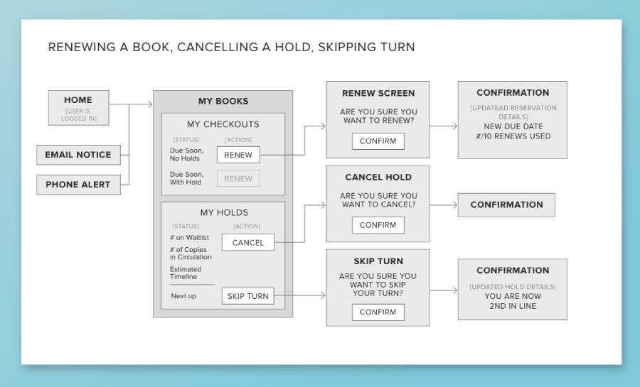
From this brainstorm session, I created more formal User Flows that assess the needed pages, inputs and outputs, and system checks for specific user tasks. I focused my initial design on 4 core user tasks:
Additionally, I wanted to explore a solution for one of the main frustrations that came up in my user research: providing people with more control and notice of when books on their hold list become available.
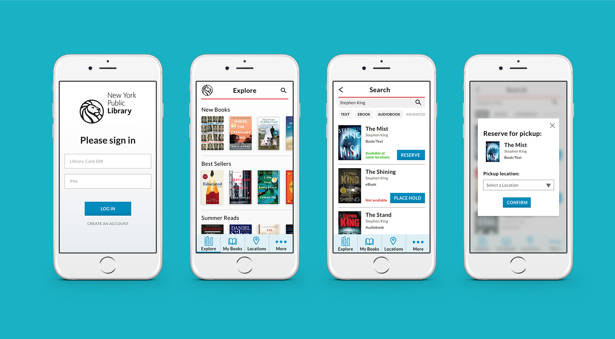
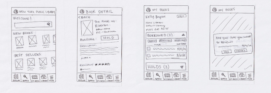
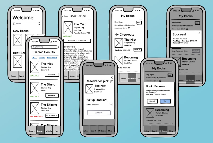
Starting with paper and pencil, I quickly sketched out a rough layout of the different pages needed based on my user flows. By hand, I can quickly iterate on design and layout decisions until I feel like I have a successful outcome. From there I re-created my sketches into digital wireframes using an online tool called Balsamiq. This allowed me to add a bit more detail while still keeping the wireframes low fidelity for early testing. I then created a clickable prototype with my wireframed pages so that I could start usability testing before getting too far into design.
View low fidelity prototype
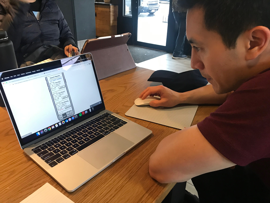
With my working prototype, I performed 3 separate usability tests with library users in order to ensure the product I was building was easy to use and understand. I asked each user to perform the four core tasks I outlined above, and observed their actions and listened to their feedback as they attempted each task. In general all users were able to complete the set tasks easily and without issue. However, user feedback and observation their interactions with the prototype highlighted several issues of clarity that should be resolved in the next round of design.
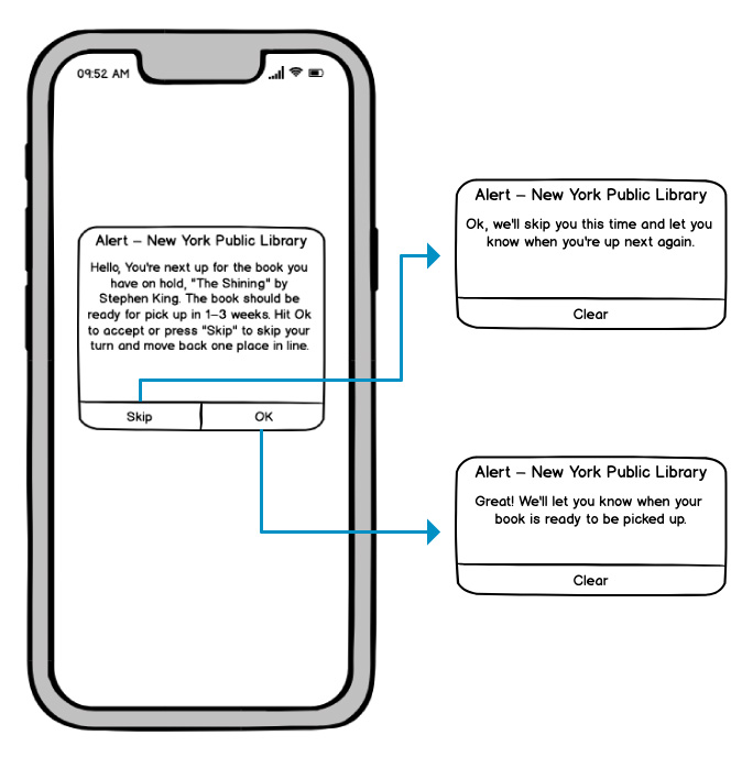
I reviewed my exploratory feature of a hold alert providing an option to “Skip a Turn” with my testers to get their feedback and reactions to this solution. They all had a positive reaction and understood how it would work, with some feedback about greater clarity in the phrase “up next” and a desire to see the selection reflected on the My Books page.
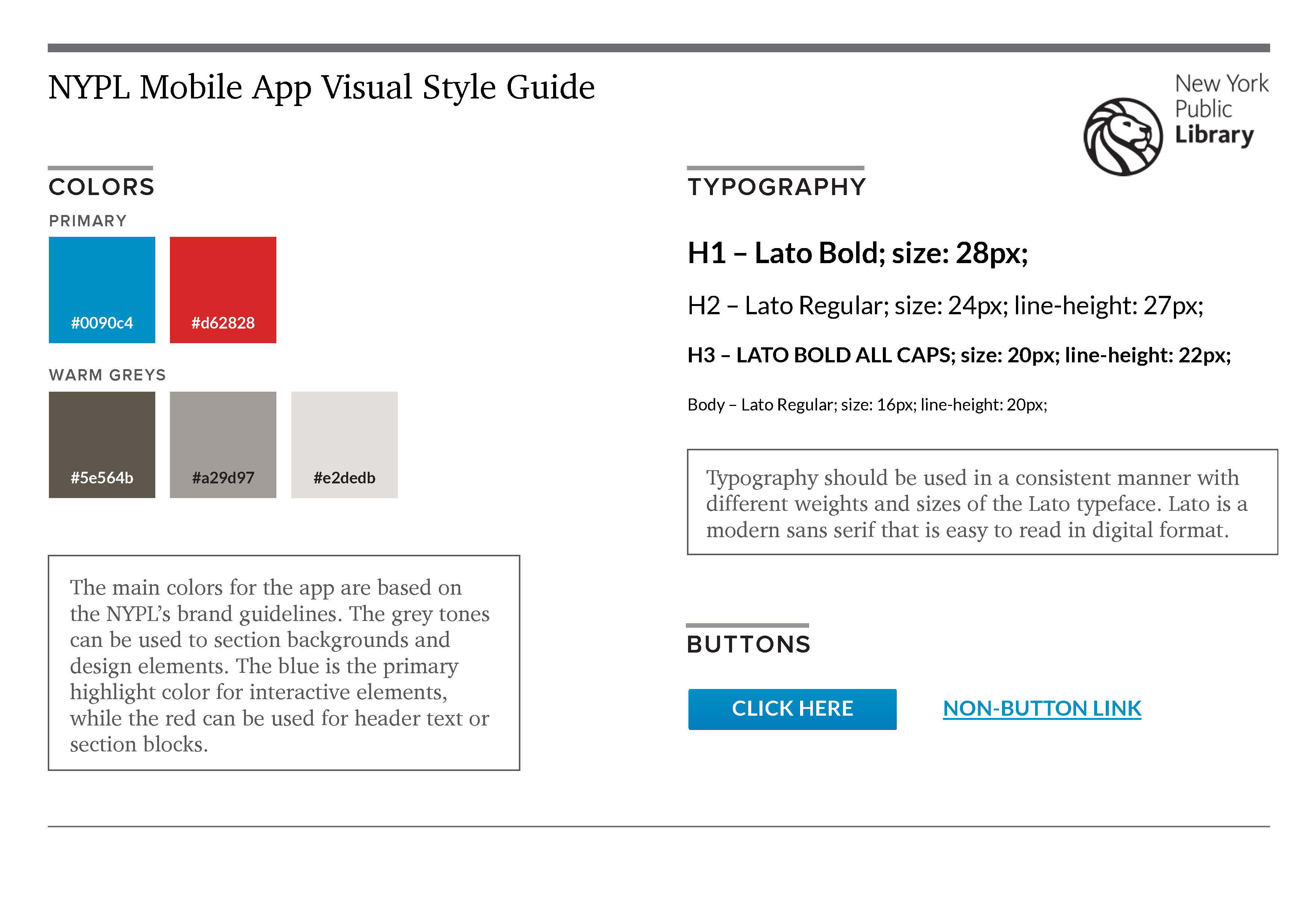
At this stage I felt confident enough in my design to start adding visual style to the app. I used the library's online brand guidelines to create a style guide for the visual design, focusing on the teal blue as my primary color with accents of red.
Once I've made all the necessary page designs for my app, I created a functional prototype using Adobe XD's prototyping tool. I will then test again with new users on the updated prototype. The high fidelity prototype will give users a more realistic experience of the app, which will allow for more detailed and accurate feedback. Testing again at this stage safeguards against more costly changes being needed during or after development.
Test prototype
Going through this process has shown me the value of user research and talking to users about their actions, behaviors, and motivations when using a product. No matter how much insight you think you already have, talking with current users will almost always reveal new information that provides a fuller understanding of your audience and your product goals.
One interesting aspect I found while talking to users is that people were willing to put up with a certain amount of frustration because the library is a free service, which they valued. This, of course, depended on people’s motivations for using the library; users with more disposable income showed less patience, often deciding to purchase a book instead of waiting, while those that valued the cost- and space-saving aspect of using the library were more willing to wait or deal with an imperfect process. As a public service organization, this is a valuable insight to help prioritize improvements and enhancements to the service. At the same time, making the library easier and more convenient for everyone will encourage more people to use the library, which generally leads to greater support and funding for the library.