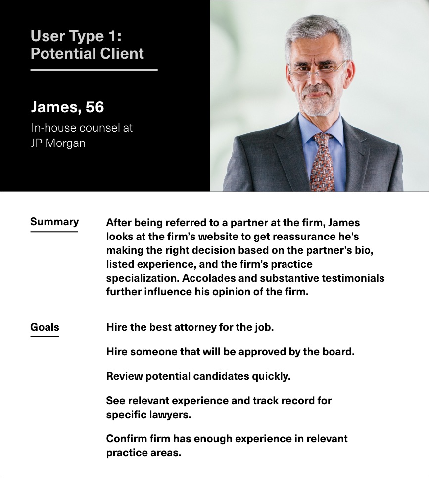
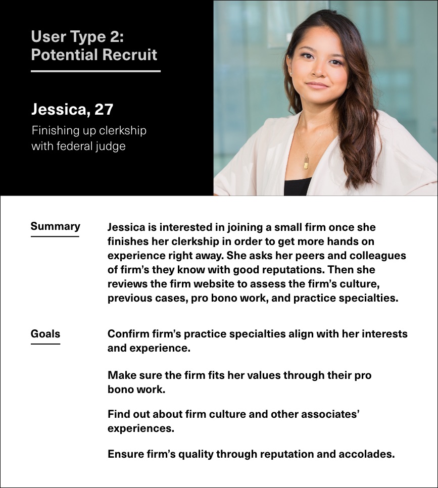
The project started with an in-depth research and discovery period. In order to create a clear and actionable brand strategy for the redesign, we analyzed the competitive landscape, interviewed key players, and audited the firm’s existing website and communications. From this research, we outlined two distinct personas for a boutique litigation firm website. These proto-personas clarify the user needs and goals, highlighting the importance of specific pages: the lawyer bios, practice areas, and career.
Our research also helped us understand the buyer journey for this type of firm. Business is primarily gained through word-of-mouth referrals and reputation, with the website serving as a secondary touchpoint to fill in the gaps. It needs to validate and reassure the potential client that the firm and its lawyers have the desired experience and accomplishments. Personality also plays an important role both in attracting clients and recruiting new lawyers, because both are looking for people they will like working with for potentially long periods of time on serious issues.
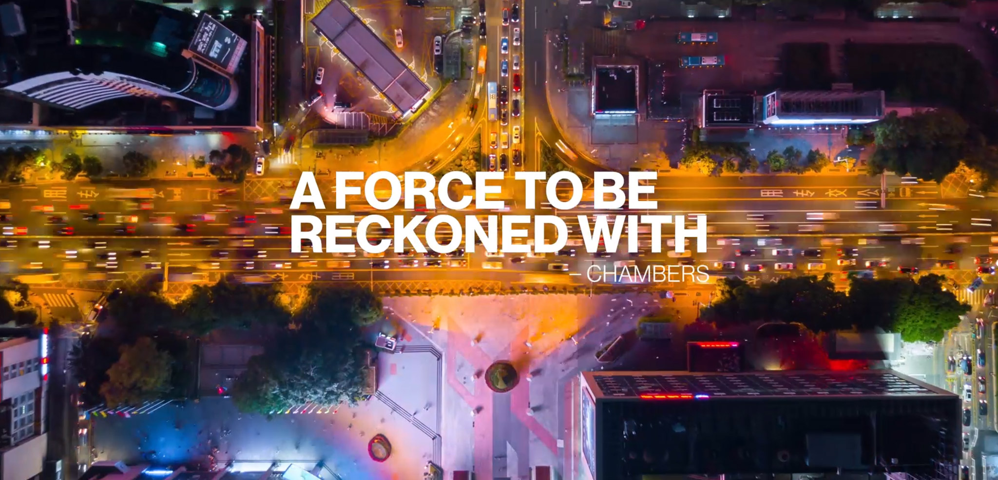
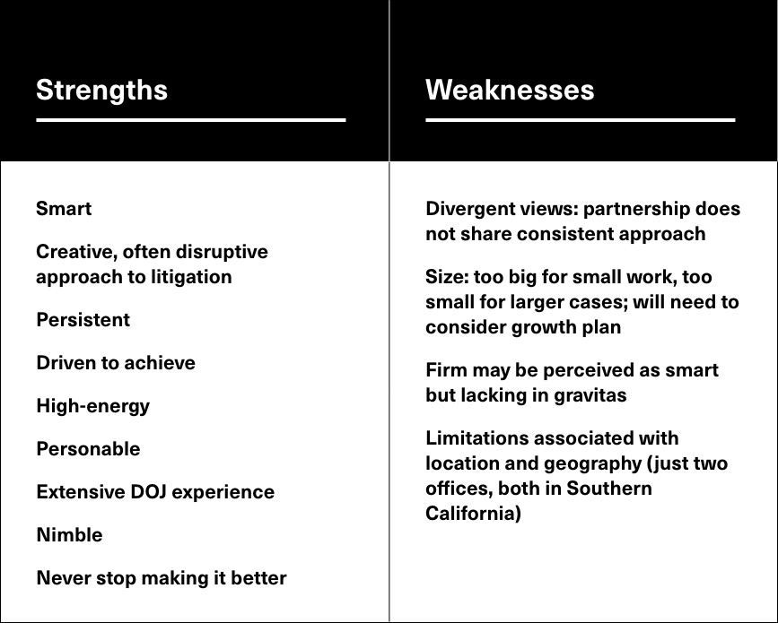
We presented a brand strategy report that outlined our research and findings. We defined the firm's strengths, weaknesses, opportunities, and threats (SWOT) based on what we learned about the firm and our assessment of how they fit in their competitive market. We developed a brand character for the firm that would distinguish them from competitors and help them win larger cases and attract top-level lawyers.
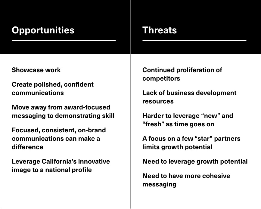
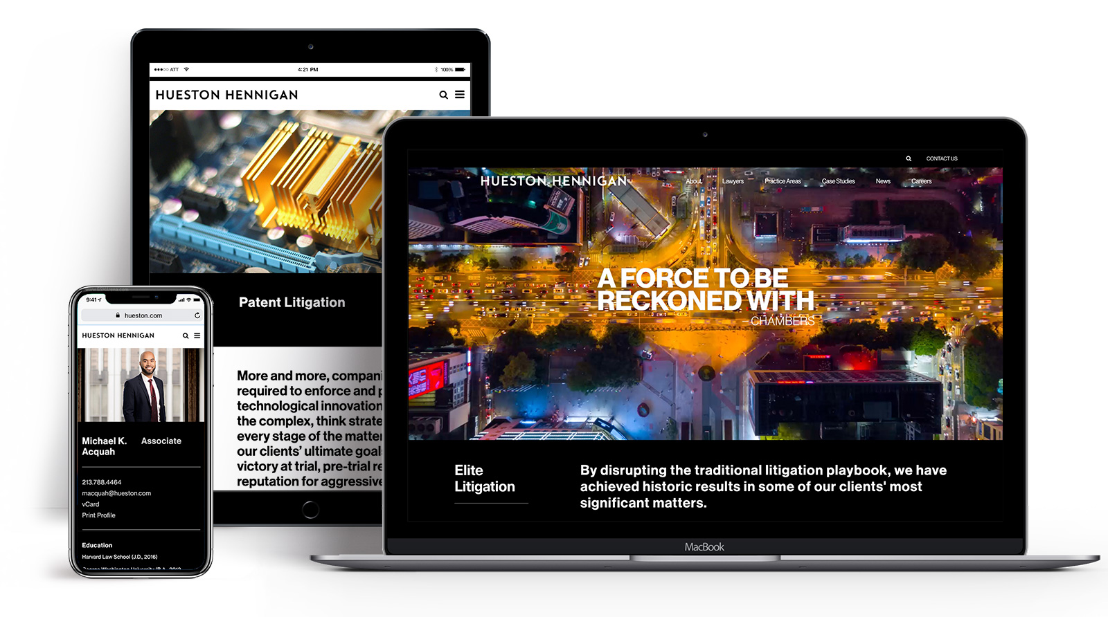
The brand strategy served as the foundation for the website and content design. I created a sitemap and quick wireframes to outline the site and content structure for the main pages of the website. Since we planned to present multiple visual design directions to the client, I didn't waste time working out page layouts, instead focusing on the main goals of each page, general organization and hierarchy of content. Keeping my user personas in mind, I recommended places for related content blocks that would help direct users to relevant parts of the site based on their goals.
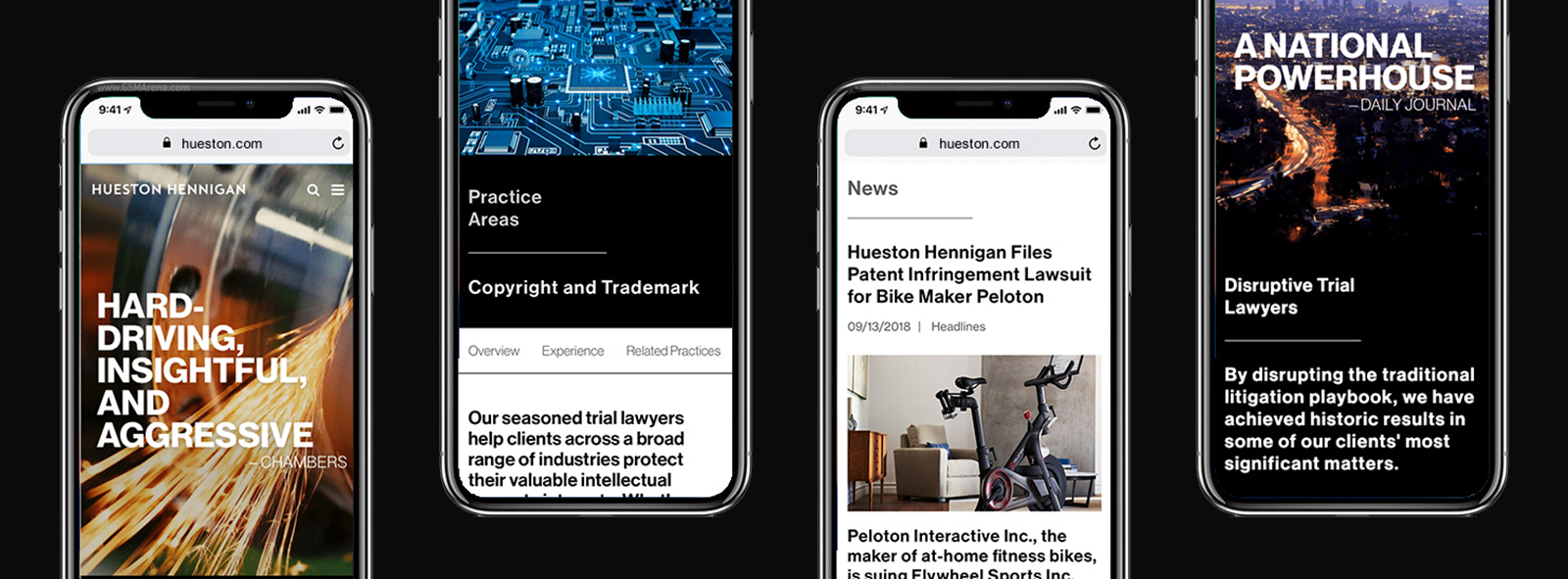
We presented four visual design directions that interpreted the brand strategy in different ways, focusing on the home, bio, and practice pages. This gave the client the opportunity to consider how far they were willing to push the idea of being disruptive in the industry through the design of the website. The selected design was the most dramatic and daring visualization of the firm’s brand.
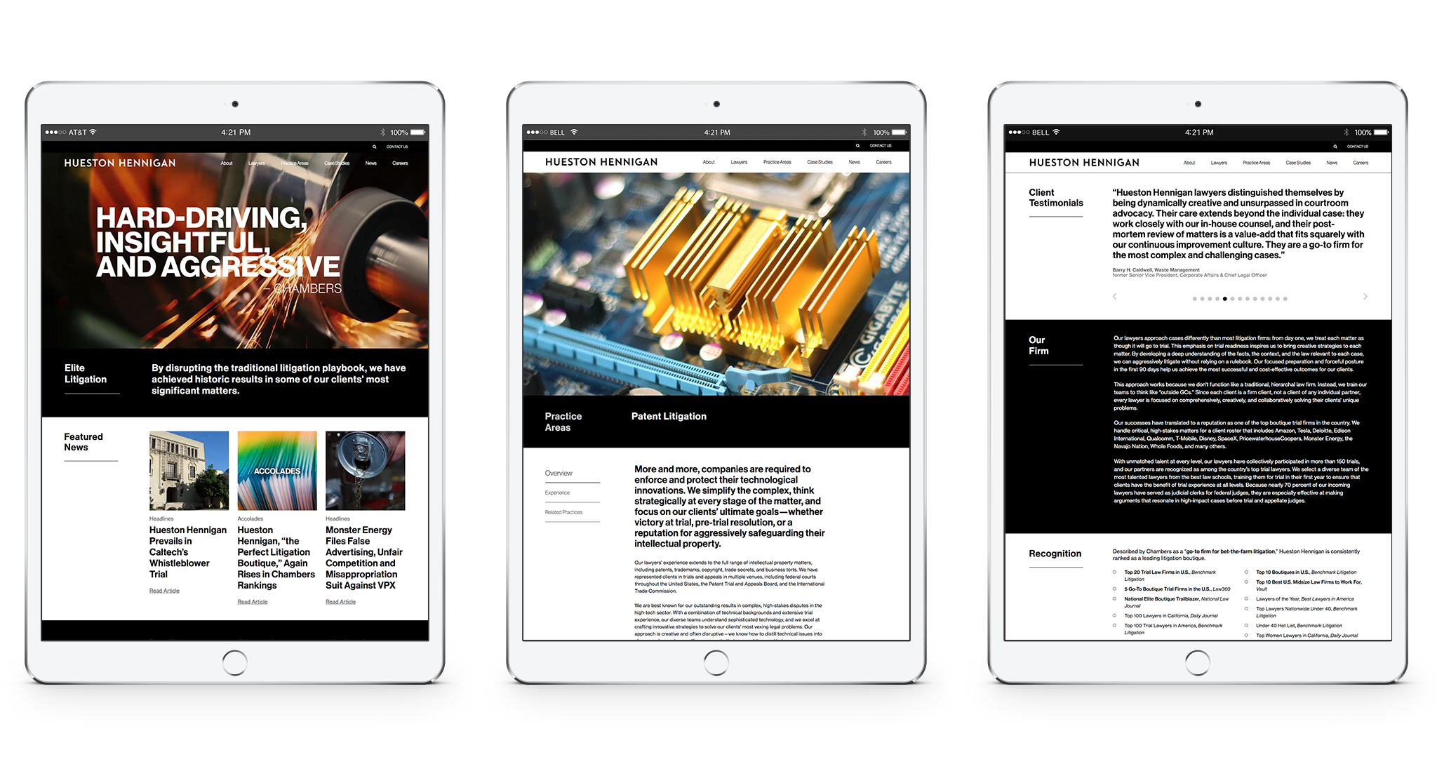
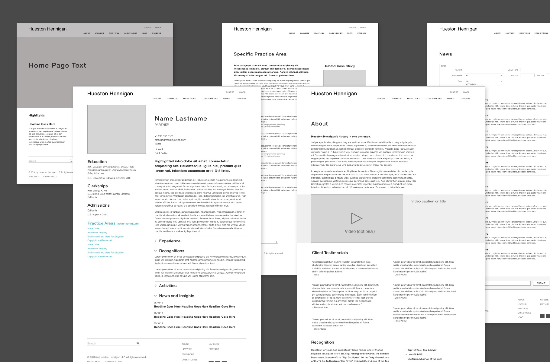
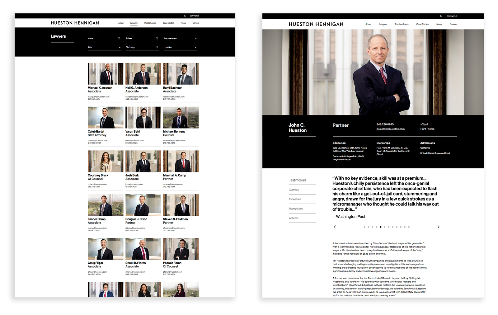
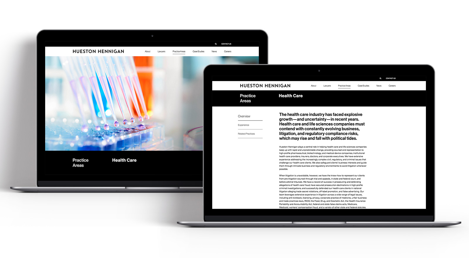
Once the visual direction was selected, I started expanding and systematizing the design across all pages of the site. Understanding that the lawyer bios are the most important pages of the site, often with long lists of experiences and activities for partners, they needed to be more than just an information dump. I designed a submenu in the sidebar for users to jump to specific sections, as well as expandable drawers to reduce longer content for scannability, with the ability to dig deeper if desired. Related content blocks link the bios, practices, and news pages to keep users engaged and direct their flow to relevant information on the site. Additionally, an enhanced search and filter capabilities further enhance the user experience.
Studio: Decker Design, 2018
Creative Director: Lynda Decker
Lead Designer: Kelly Bryan
Designer: Evander Batson
Animation: Eli Guillou
Copywriting and Content Strategy: Deborah Gaines Associates
Development: Tenrec