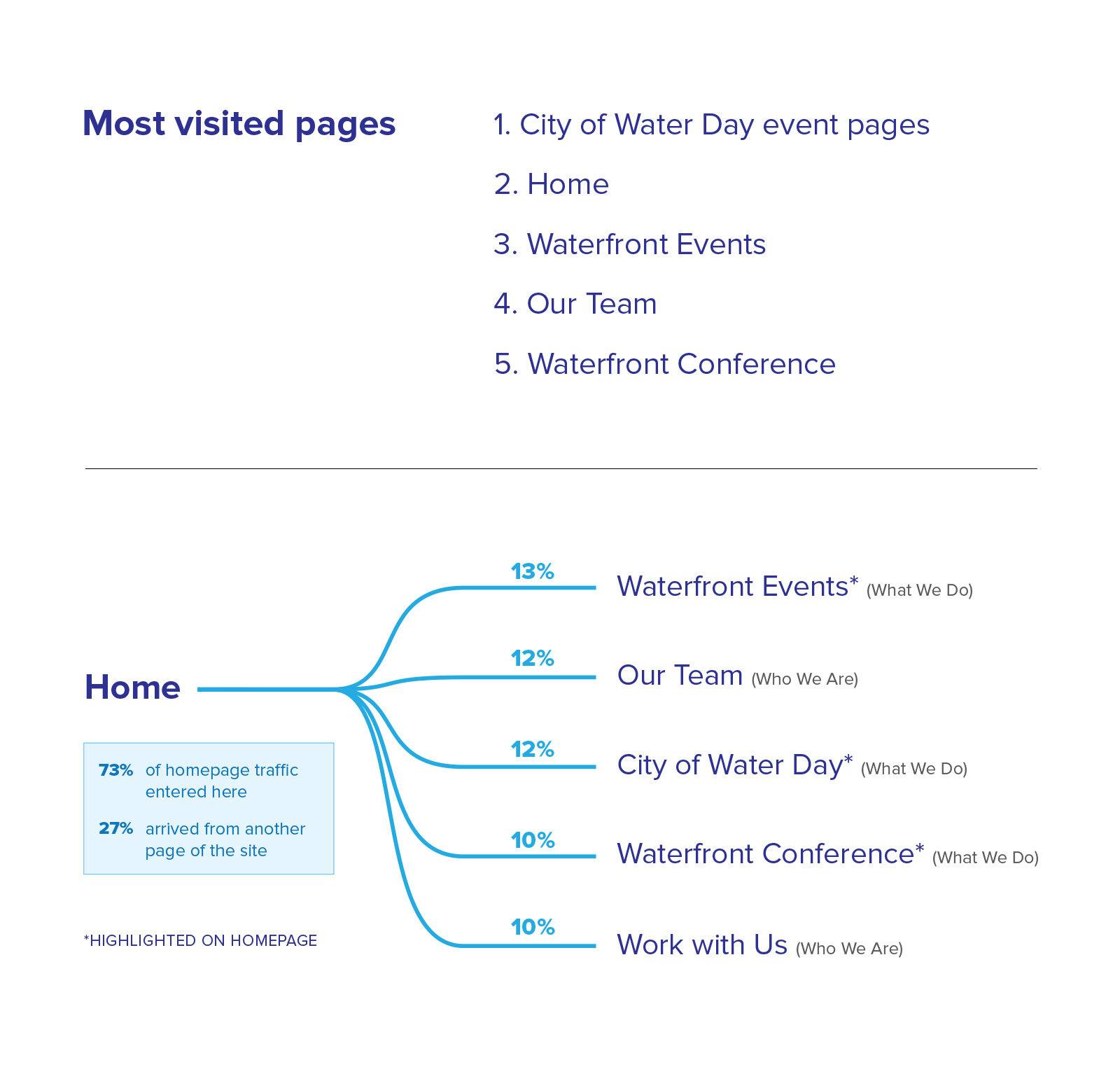
Before getting started, I reviewed the site’s analytics to understand how users were arriving and moving through the site. From this data, I learned that the most visited pages of the site were specific event pages, the home page, and the team page, which would help focus our priorities when we made design changes to the site. Looking at the homepage data, I assessed where most users went next on the site to gain insight into potential user goals and how effective content on the homepage was driving user engagement.
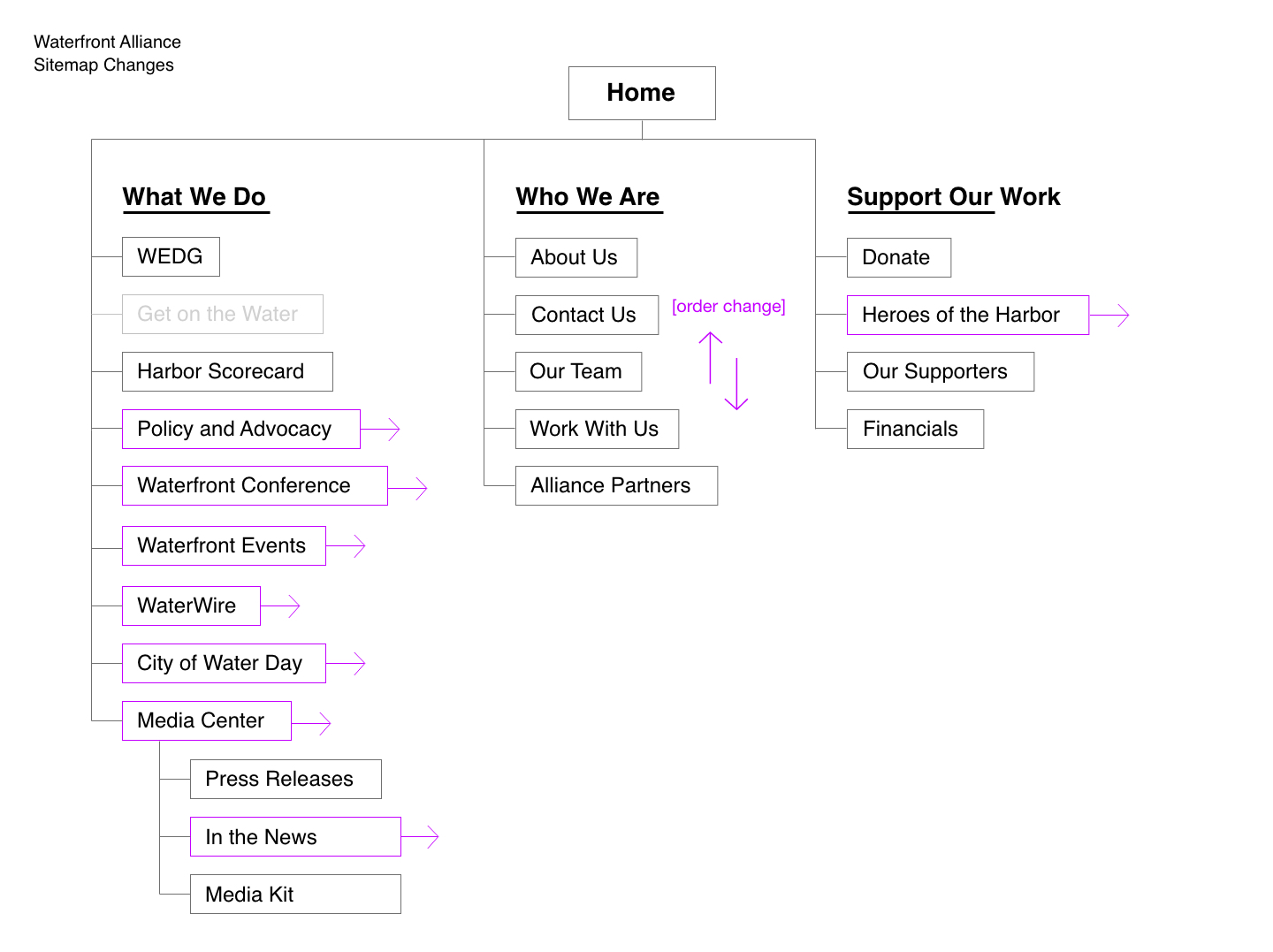
After discussing the client’s needs and goals, the project scope became more than just a simple update, with over half the site’s pages being redesigned, as well as an updated navigation structure. In order to meet a short deadline of only 6 weeks, I suggested breaking up the site redesign into multiple phases starting with the homepage. This way we could quickly redesign and launch a new homepage that communicated their new strategic direction and laid the foundation for future changes in time for their biggest event, the Waterfront Conference. Phases 2 and 3 started once new content was finalized, with design and development lasting around 4 months.
.jpg)
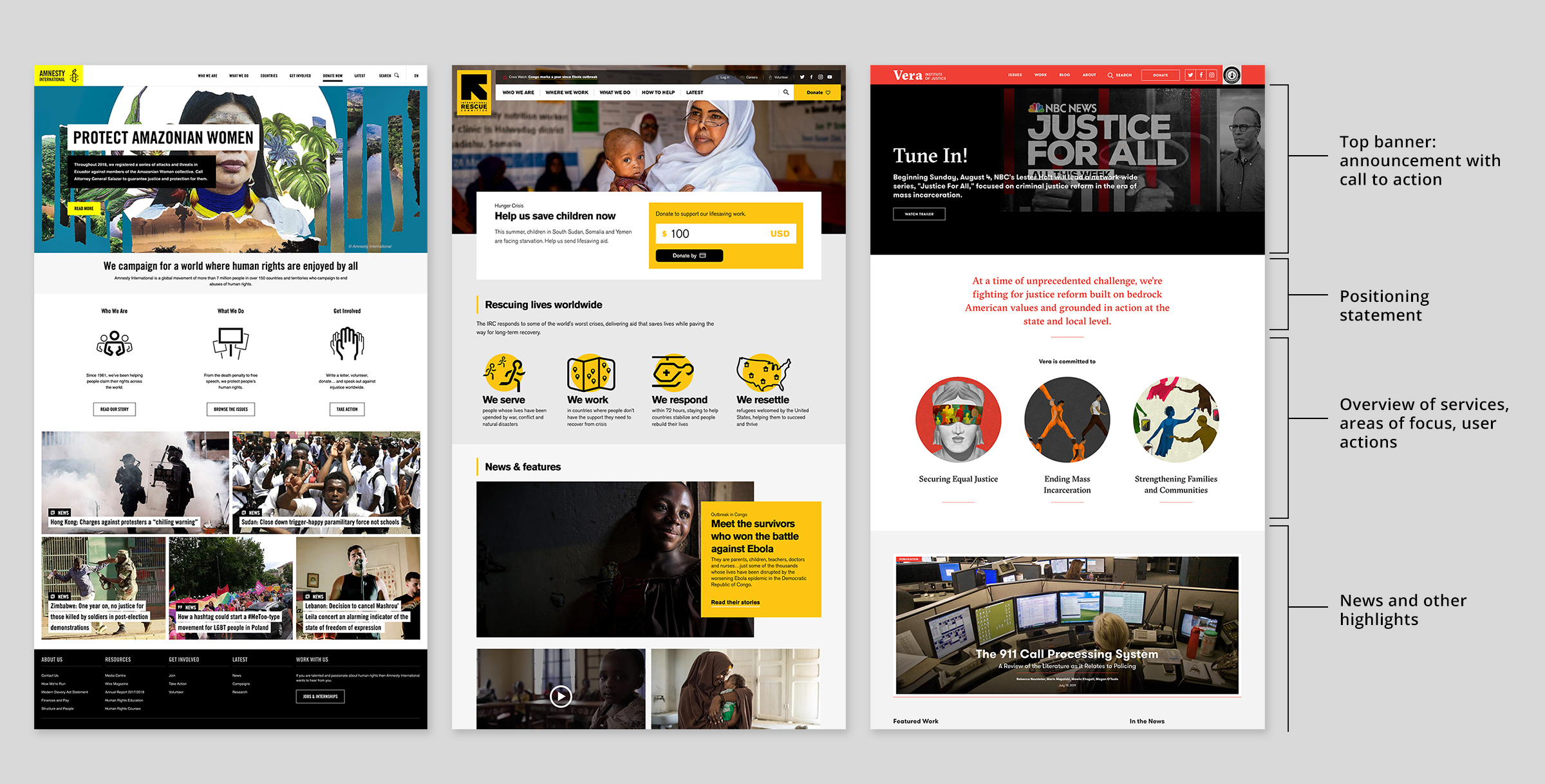
As part of my research, I reviewed the websites of other non-profits and gathered examples of sites I thought effectively communicated their mission with a well designed homepage. This not only provided insight into user expectations for this type of website, but also helped influence the client toward needed changes to the page layout.
Many of the sampled sites followed a pattern for the homepage layout: banner image with CTA, positioning or mission statement, followed by icon imagery to represent areas of work or other actions to be taken. Lower on the page, organizations usually included news and other timely features. Presenting this research to the client along with the strategy behind different decisions, helped frame our own conversation about the homepage design and what content was the most important.
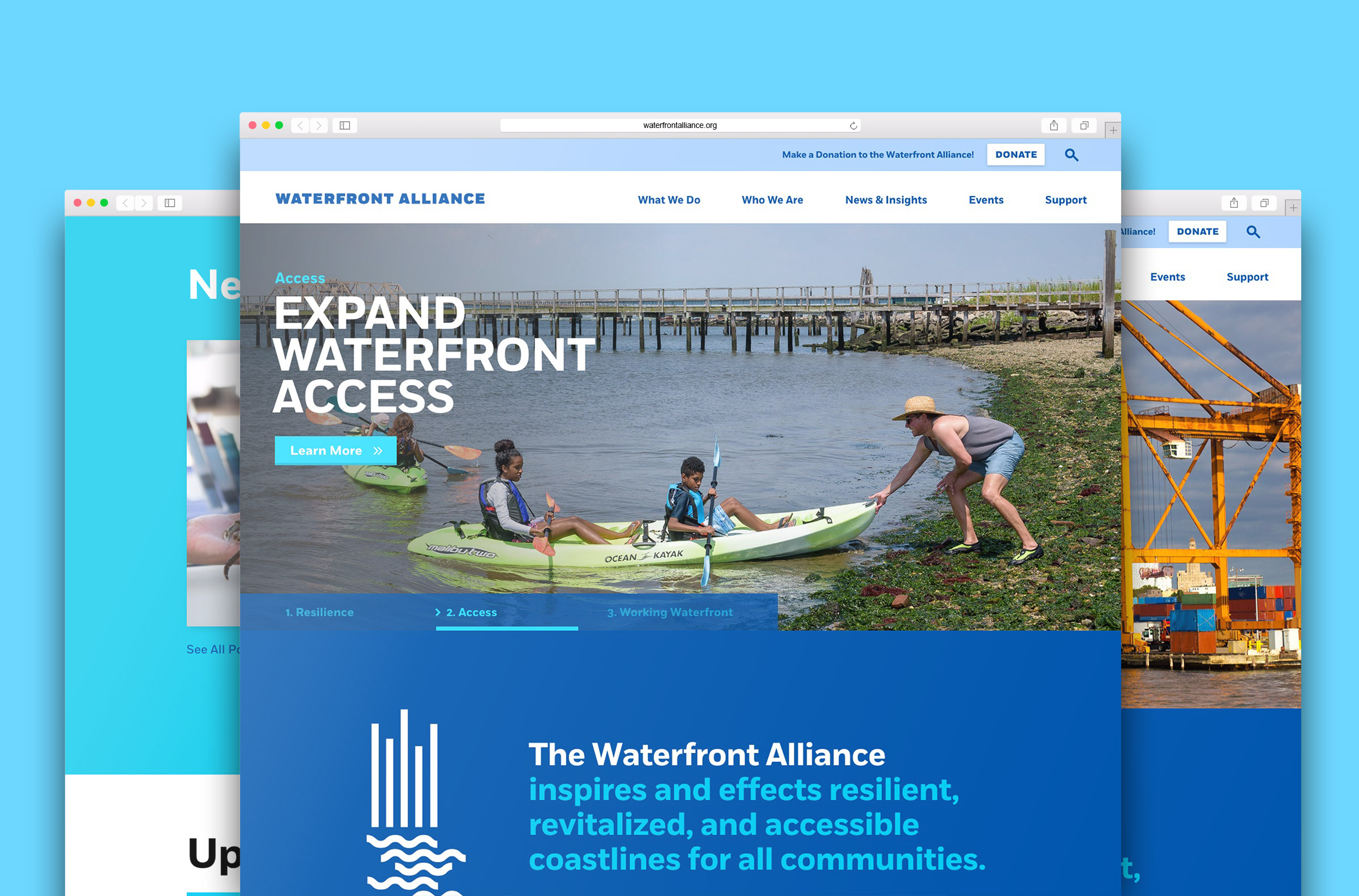
As our first priority and one of the most viewed pages, I worked through multiple iterations of design and content layouts that would meet the client’s goals of highlighting their main programs and presenting themselves as experts.
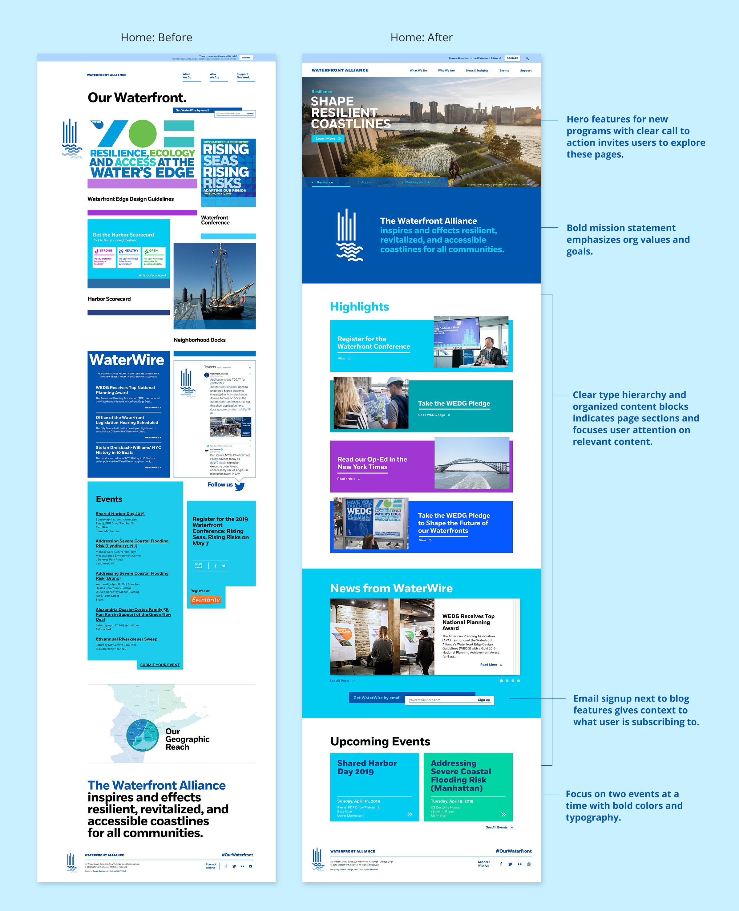
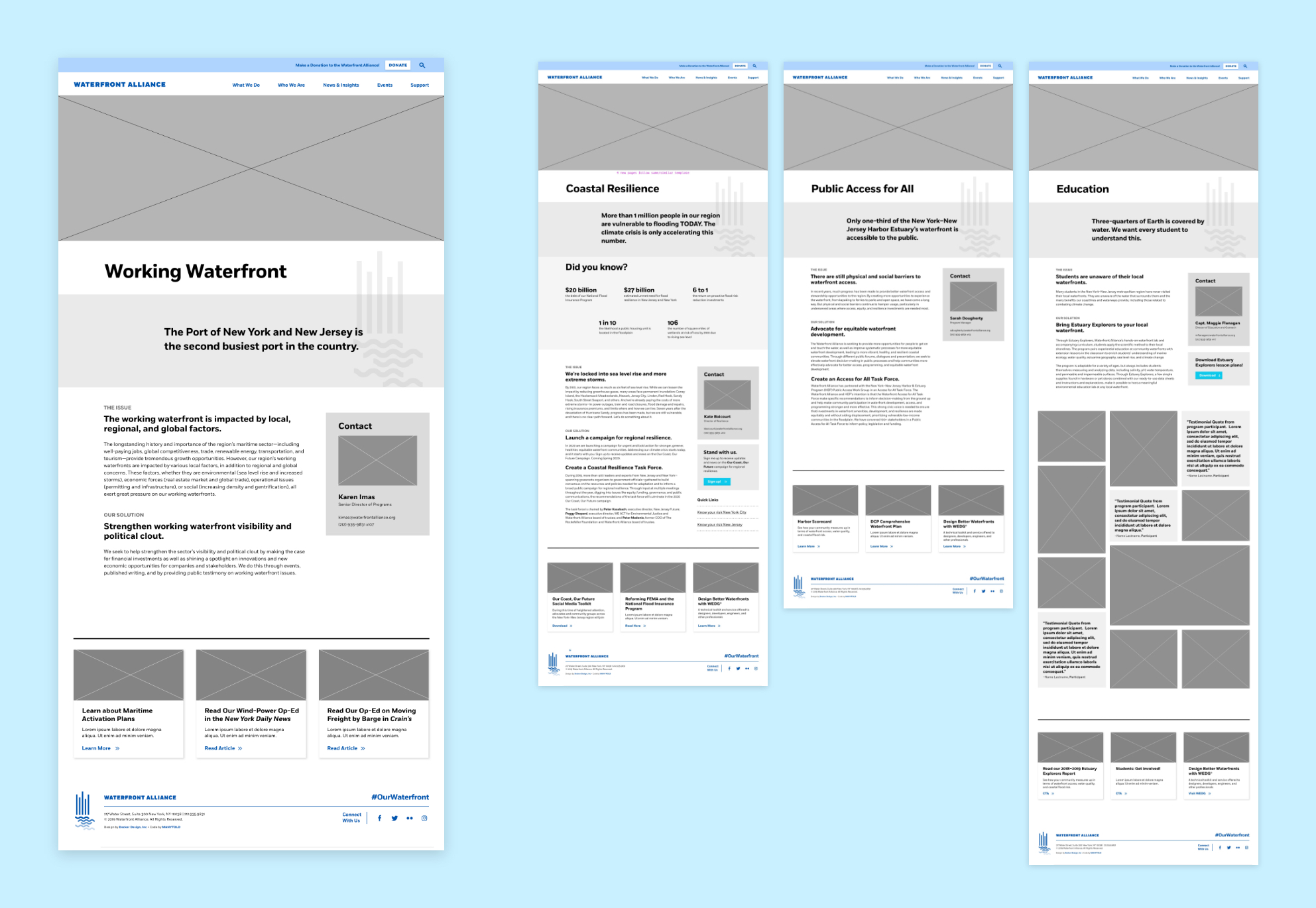
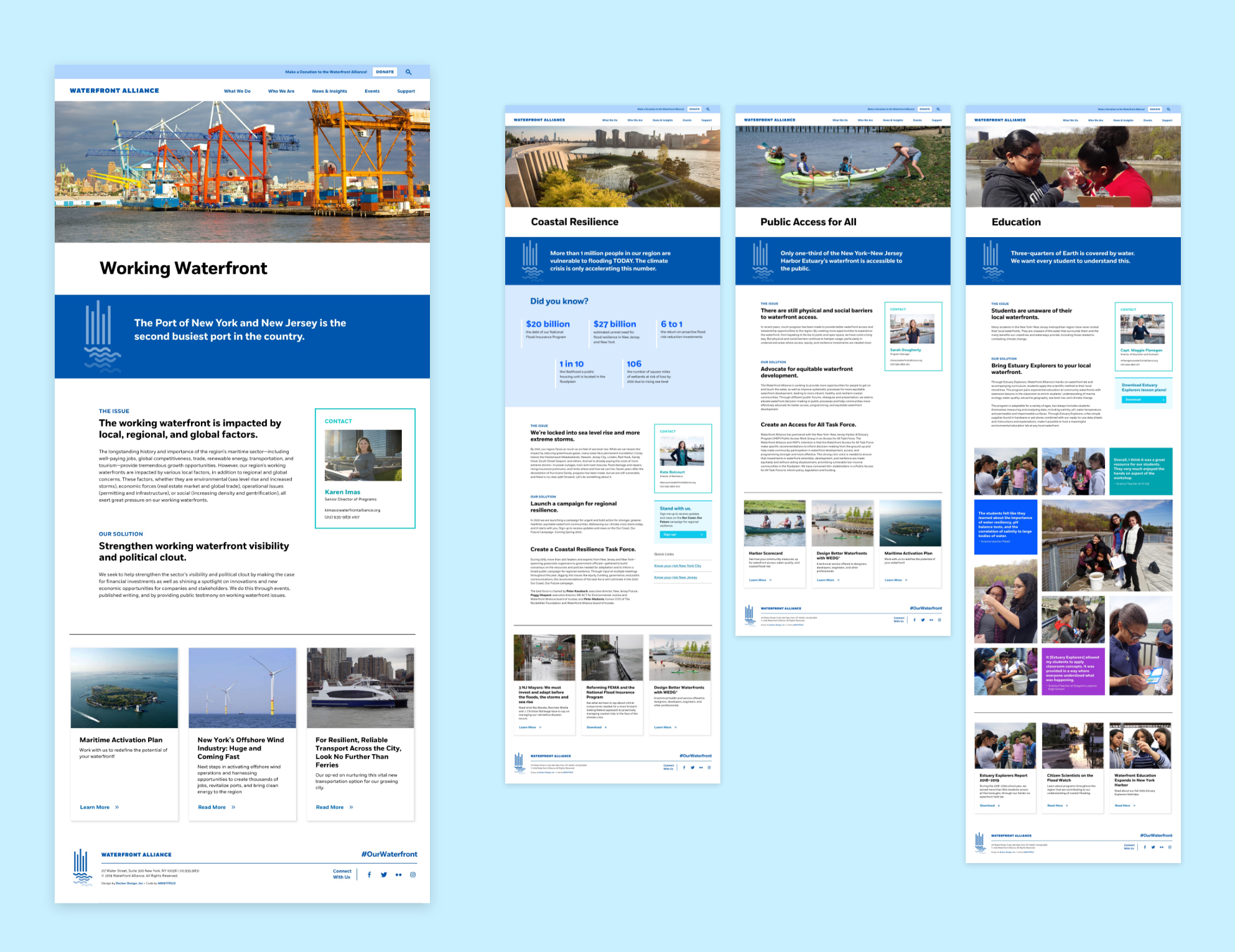
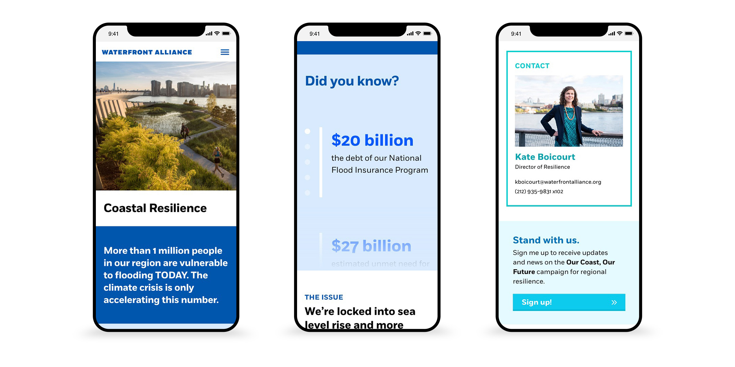
Looking at the previous homepage, I found the design to be visually cluttered leading to an overwhelming and confusing user experience. My main goal was to improve the experience through simplified content sections and clearly defined call to actions to guide users to relevant parts of the site. I worked within the existing visual language to maintain the friendly, accessible feeling of the brand. At the same time, I created a more structured approach to color, typography, and imagery that elevated the brand to better serve the organization’s goal of being seen as experts in the field of coastal resilience and conservation.
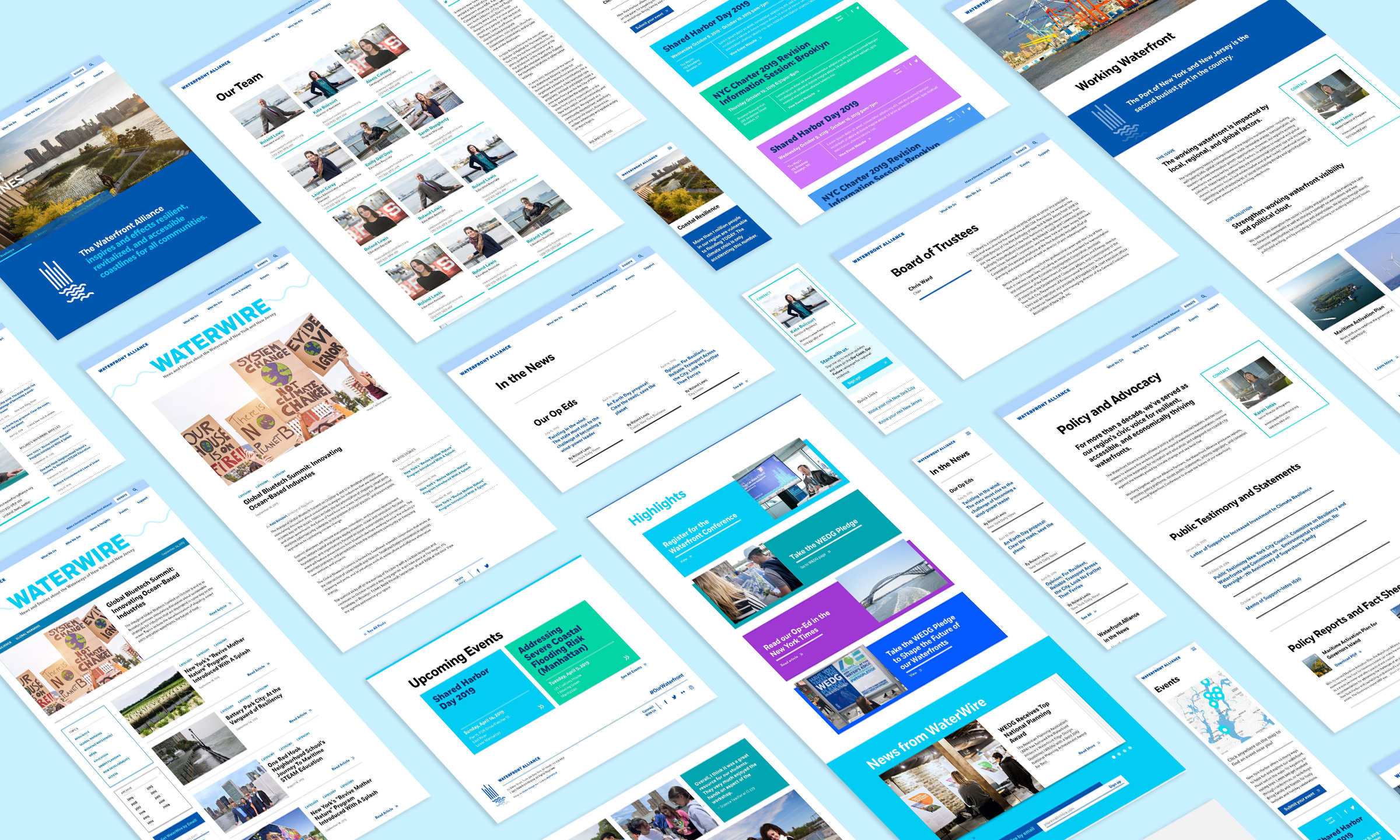
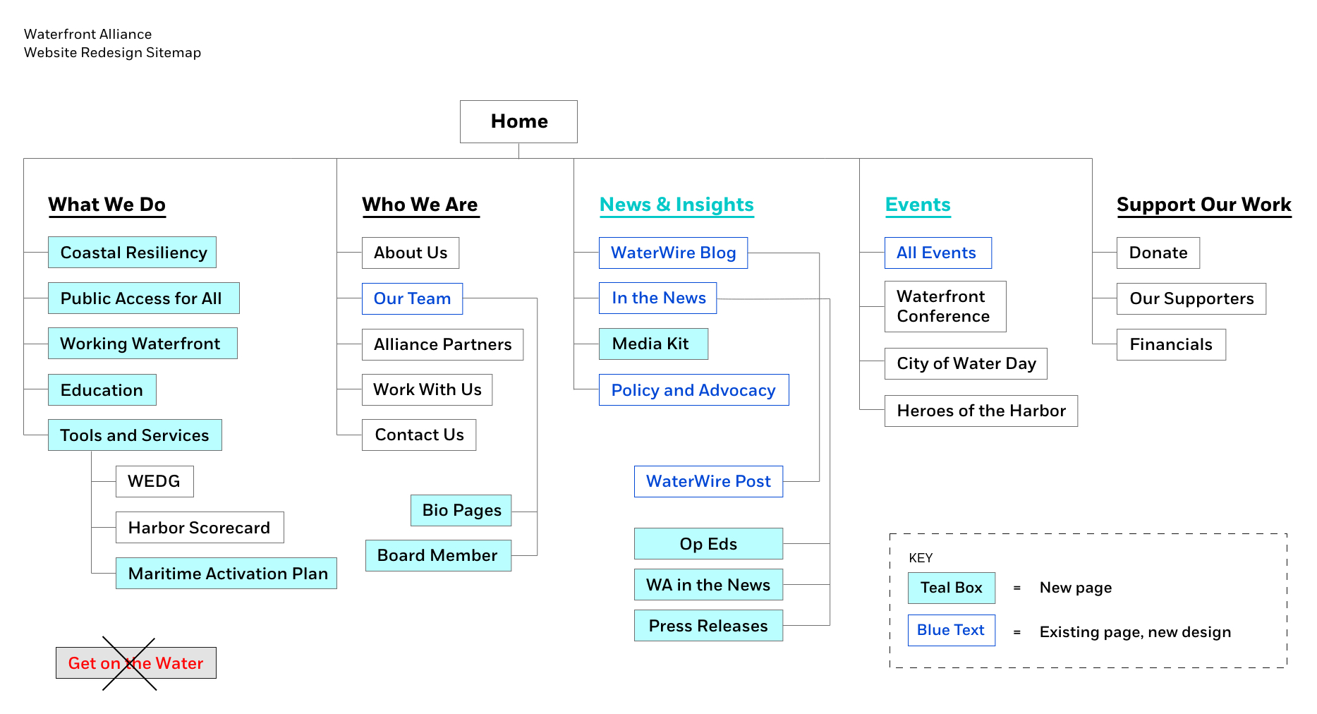
Four new pages needed to be designed that outlined the organization’s new focus areas. In order to give the client maximum flexibility and control while retaining a consistent structure, I designed these pages in a templated layout with modular elements that could be reused on other site pages. This makes editing or adding new pages an easy change for the client to handle themselves.
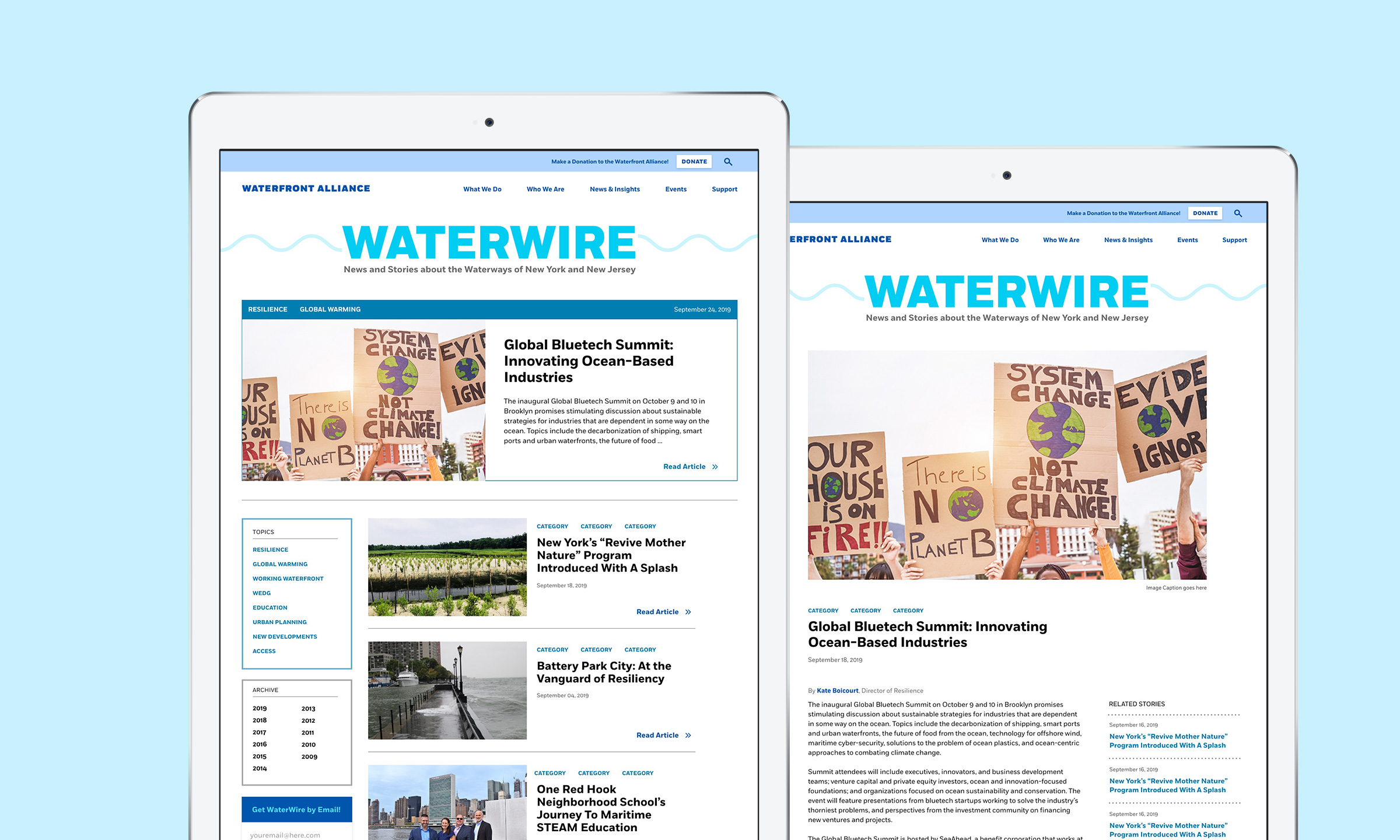
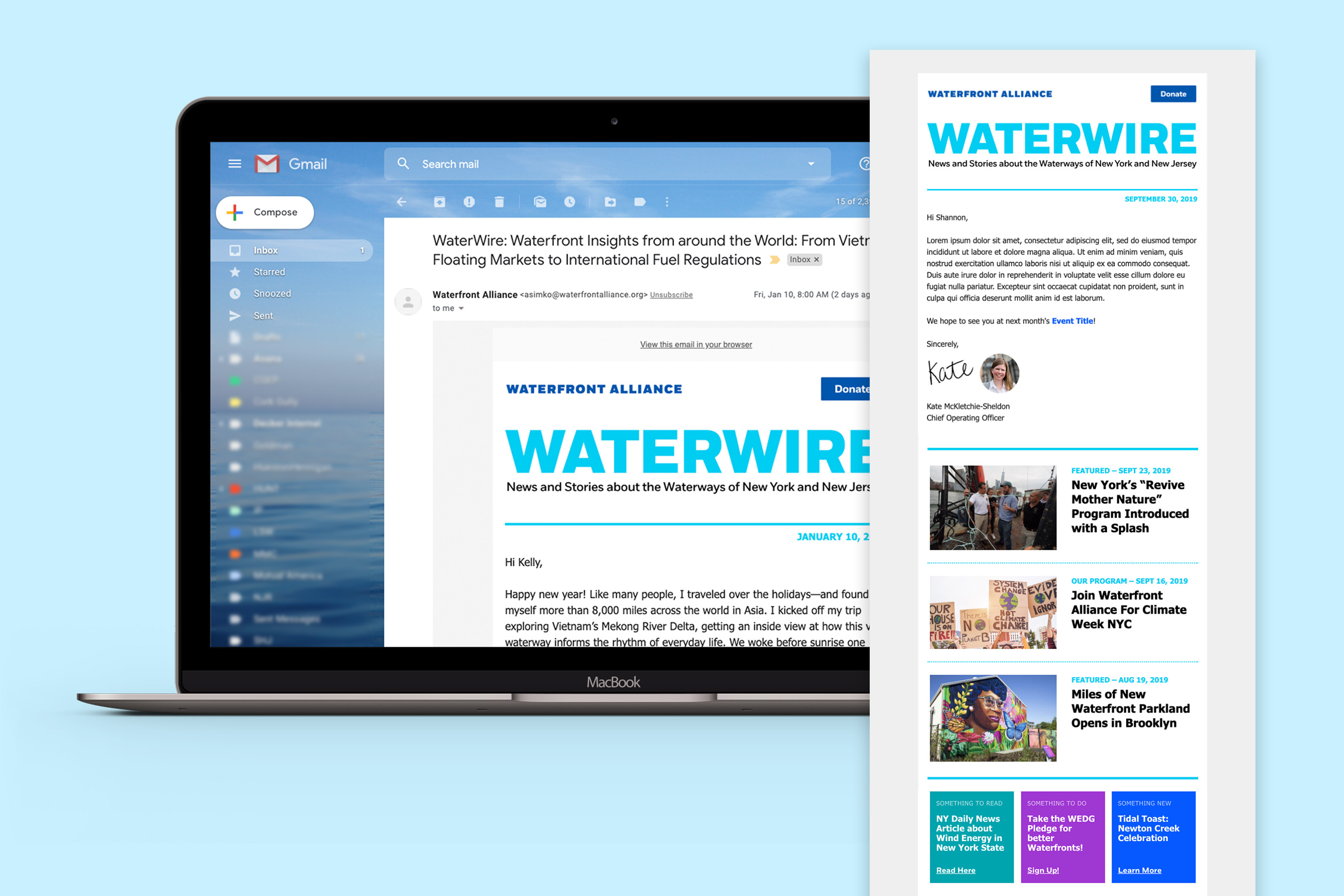
The previous blog page was poorly organized with a cluttered layout. Older posts got lost in an archive section that even the client had trouble sifting through. I suggested a number of updates to this page that would allow for easier search and finding topical content as well as a cleaner layout with clear article organization and order. On post pages, we added in a linked author name and related content that helps keep the user engaged and moving through the site. Additionally I designed a new email template for their biweekly newsletter that correlated with the design style on the website.
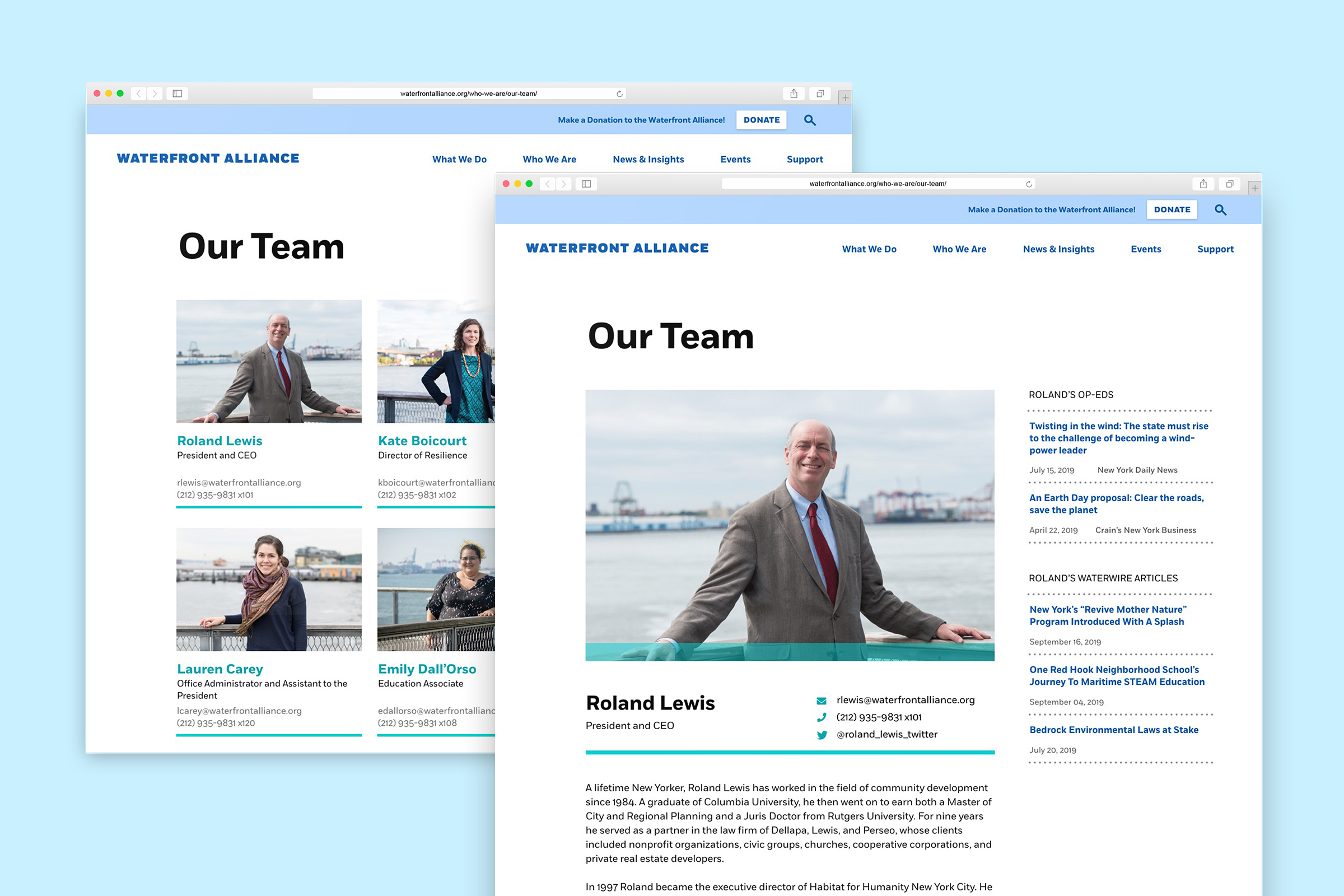
We know from the analytics that the team page is one of the most visited on the site, so how might we leverage that to feed users to other parts of the site? Or make it easier to find a specific person? The previous design had a single page, single column layout with everyone’s image and biography in a long list. As the team grew beyond the initial few members, this format had become unwieldy, making finding a specific team member cumbersome. Redesigning the page to use a standard grid format with basic contact info, made browsing and finding a specific person simple and accessible. Clicking on an individual now takes the user to a biography page where more detail on the person, their projects, and their writing can be included.
Overall the redesign has been a great success, with improved user flows, content hierarchy, and usability. The redesigned pages offer a cleaner, simplified layout that makes content easy to understand and promotes user engagement throughout the site. With limited time and budget, we weren't able to do any first hand user research or testing for this redesign, but relied on third party research for usability standards. It will be interesting to review the site analytics again once all the changes have been live for a few months to assess how users are engaging with the site. Hopefully in future, Waterfront Alliance will be able to allocate more resources to understanding their users in order to continue to strategically improve their website to meet both business and user goals. I enjoyed the challenge of working within an existing framework to both maintain the look and feel while also refining and enhancing the system to better work for the web.
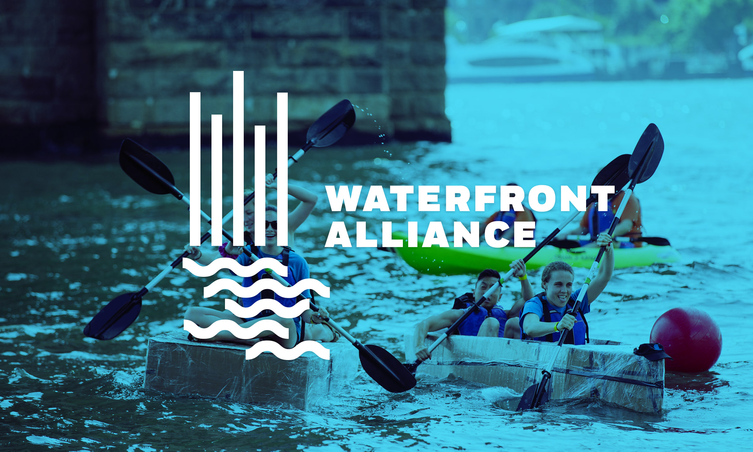
Studio: Decker Design, 2019
Creative Director: Lynda Decker
Designer: Kelly Bryan
Development: Manyfold